
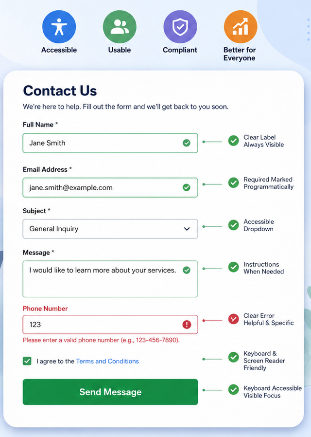
Form Field Accessibility: WCAG Best Practices for Accessible Website Forms
Form Field Accessibility: The Hidden Problem Costing Businesses Customers
Forms are one of the most important elements on any website. Whether visitors are requesting a quote, booking an appointment, creating an account, or completing a purchase, forms are where conversions happen.
Unfortunately, many websites still contain inaccessible forms that create barriers for people with disabilities. A form that looks visually appealing isn’t necessarily usable for everyone. Missing labels, confusing error messages, poor keyboard support, and inaccessible validation can prevent users from completing even simple tasks.
The good news is that most form accessibility issues are preventable. By following the Web Content Accessibility Guidelines (WCAG) and implementing user-friendly design practices, businesses can create forms that are easier to use for everyone—not just users with disabilities.
Why Accessible Forms Matter
An accessible form helps users:
- Navigate using only a keyboard
- Understand what information is required
- Receive clear guidance when errors occur
- Complete tasks using screen readers
- Successfully submit information without unnecessary frustration
Accessible forms improve:
- User experience
- Customer satisfaction
- Conversion rates
- Search engine optimization (SEO)
- Legal compliance with accessibility regulations
When users can complete your forms quickly and confidently, they’re much more likely to become customers.
Common Form Accessibility Problems
1. Missing or Incorrect Labels
One of the most common accessibility mistakes is relying only on placeholder text instead of proper labels. Poor Example:
[Enter your email]Once the user starts typing, the placeholder disappears, making it difficult to remember what information was requested.
Always associate every input field with a visible label. Screen readers can correctly announce the field, and users always know what information is required.
2. Placeholder Text Used as Instructions
Placeholder text should never replace instructions.
Use:
Password
Must contain at least 8 characters, one uppercase letter, one number, and one special character.
Providing instructions before users begin typing reduces errors and improves completion rates.
3. Required Fields Not Clearly Identified
Users should immediately know which fields are mandatory.
Instead of relying only on a red asterisk(*), use multiple indicators:
- Required text
- Programmatically identified required fields
- Clear instructions at the beginning of the form
Screen readers should announce that the field is required.
4. Error Messages That Don’t Explain the Problem
Many websites display messages like “Invalid input”
This doesn’t help users understand what needs to be corrected.
A better message would be:
Please enter a valid email address such as name@example.com.
Good error messages should:
- Explain what went wrong
- Describe how to fix it
- Be associated with the correct field
- Be announced by assistive technology
5. Poor Keyboard Accessibility
Many users cannot use a mouse. Every form should allow users to:
- Move through fields using the Tab key
- Activate buttons with Enter or Space
- Select checkboxes using the keyboard
- Open dropdown lists without a mouse
Keyboard users should never become trapped inside a form.
6. Missing Focus Indicators
When users navigate with the keyboard, the currently selected field should always be visible. A clear focus indicator helps users understand where they are on the page.
Removing the browser’s default focus outline is one of the most common accessibility mistakes. Instead, replace it with a highly visible custom focus style.
7. Color Used as the Only Indicator
Imagine a required field outlined in red only.Users with colour blindness may not notice anything unusual.
Instead, combine:
- Icons
- Text
- Color
This ensures everyone understands the message.
8. Inaccessible CAPTCHA
Traditional CAPTCHA challenges often prevent users with disabilities from completing forms. Whenever possible, use more accessible alternatives such as:
- Invisible CAPTCHA
- Honeypot techniques
- Accessible verification methods
- Multi-factor verification when appropriate
9. Incorrect Grouping of Related Fields
Radio buttons and checkboxes should be grouped using semantic HTML. For example:
Shipping Method:
- Standard
- Express
- Next-Day Delivery
Screen readers understand these relationships when fields are grouped correctly.
10. Time Limits Without Warning
Some forms automatically expire after a short period. Users who require additional time – including people using assistive technologies – may lose all entered information.
Provide:
- Advance warnings
- Options to extend time
- Automatic saving where possible
WCAG Success Criteria Related to Form Accessibility
Several WCAG 2.2 Success Criteria directly affect forms, including:
- 1.3.1 Info and Relationships
- 1.3.5 Identify Input Purpose
- 2.1.1 Keyboard
- 2.4.3 Focus Order
- 2.4.7 Focus Visible
- 3.3.1 Error Identification
- 3.3.2 Labels or Instructions
- 3.3.3 Error Suggestion
- 3.3.7 Redundant Entry
- 3.3.8 Accessible Authentication
- 4.1.2 Name, Role, Value
Meeting these requirements improves both accessibility and usability across devices.
Accessibility Benefits Everyone
Accessible forms aren’t designed only for people with permanent disabilities.
They also help:
- Older adults
- Mobile users
- Users with temporary injuries
- People in bright sunlight
- Users with slow internet connections
- Individuals who aren’t fluent in your website’s language
Better accessibility creates a smoother experience for every visitor.
How to Test Form Accessibility
A comprehensive accessibility review should include:
Automated Testing
Use accessibility testing tools to detect:
- Missing labels
- Form structure issues
- Color contrast failures
- ARIA misuse
- Missing required attributes
Automated tools are helpful, but they cannot identify every issue.
Manual Keyboard Testing
Verify that users can:
- Reach every field
- Submit the form
- Navigate in a logical order
- Clearly see keyboard focus
Screen Reader Testing
Test forms using popular screen readers to ensure:
- Labels are announced correctly
- Instructions are understandable
- Required fields are identified
- Errors are communicated effectively
Real-world testing provides insights that automated scans cannot.
Best Practices Checklist
Before publishing any form, verify that:
- Every field has a visible label.
- Required fields are clearly identified.
- Instructions are easy to understand.
- Keyboard navigation works correctly.
- Focus indicators are always visible.
- Error messages are descriptive and connected to the relevant field.
- Color is never the only way information is communicated.
- Related controls are grouped logically.
- CAPTCHA solutions are accessible.
- Forms are tested with assistive technologies.
Final Thoughts
An accessible form is more than a technical requirement—it is an essential part of creating an inclusive digital experience. Every inaccessible field represents a potential customer who may abandon your website out of frustration.
By following WCAG guidelines and designing with all users in mind, businesses can improve usability, increase conversions, strengthen SEO performance, and demonstrate a genuine commitment to digital inclusion.
Accessibility is not about checking boxes; it’s about ensuring every visitor has an equal opportunity to interact with your website and complete their goals.
Frequently Asked Questions (FAQ)
What is form field accessibility?
Form field accessibility is the practice of designing online forms so that everyone, including people with disabilities, can understand, navigate, complete, and submit them using assistive technologies, keyboards, or other input methods.
Why are accessible forms important for SEO?
Accessible forms improve user experience by reducing frustration and increasing engagement. Better usability can lead to lower bounce rates, higher conversion rates, and improved search engine performance because search engines prioritize websites that provide a positive user experience.
Which WCAG guidelines apply to web forms?
Key WCAG Success Criteria include 1.3.1 Info and Relationships, 2.1.1 Keyboard, 2.4.7 Focus Visible, 3.3.1 Error Identification, 3.3.2 Labels or Instructions, 3.3.3 Error Suggestion, 3.3.7 Redundant Entry, 3.3.8 Accessible Authentication, and 4.1.2 Name, Role, Value.
Can automated accessibility tools detect all form issues?
No. Automated tools can identify many technical issues, such as missing labels or contrast problems, but manual testing with keyboards, screen readers, and real users is essential to uncover usability issues that automated scans cannot detect.